HRKatha, a leading platform for HR professionals worldwide, marks its tenth anniversary with a vibrant new brand identity and website. This makeover aims to reinforce HRKatha’s position at the forefront of the HR news sector.
Design Details
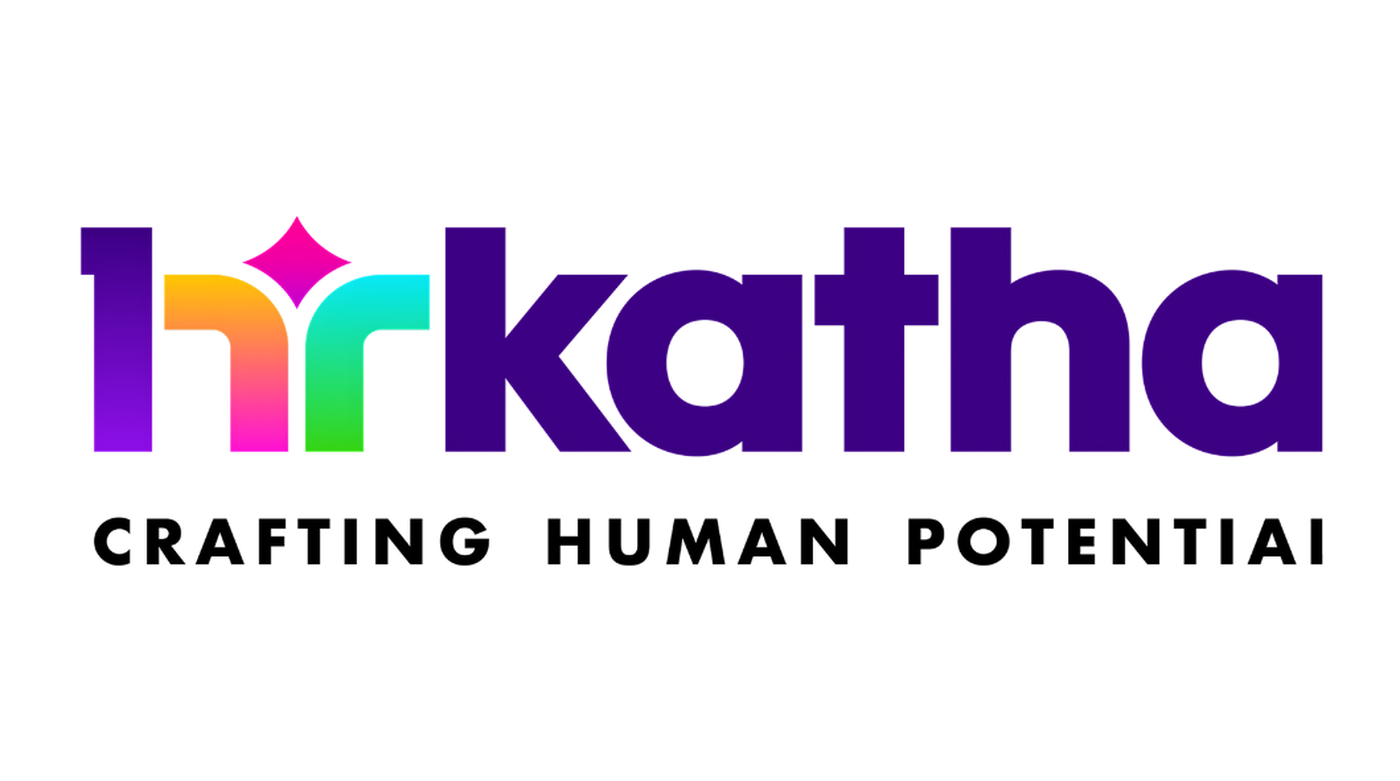
The updated logo uses a modern, lowercase font for 'hrkatha' to merge approachability with professionalism. The 'hr' part is designed to serve two roles: it acts as a unique symbol and forms part of the brand name. A closer look reveals that the 'hr' also subtly incorporates a '1', symbolizing HRKatha's leadership. The design flows into the shapes of an 'h' and an 'r', mimicking a fountain—a symbol of ongoing growth and progress, and ends with a diamond, a metaphor for achievement.
New Tagline: Crafting Human Potential
The new slogan, 'Crafting Human Potential', reflects HRKatha’s dedication to fostering individual growth and potential.
A Palette of Meaning
The new color scheme includes purple for creativity, green for growth, blue for trust, pink for excellence, and yellow for joy and happiness, underscoring the brand’s values of diversity and inclusivity.
Vision for the Future
Prajjal Saha, the founder, emphasizes the redesign's focus on inclusivity and vibrant interaction, enhancing both reader engagement and the overall user experience. Mandy Kulkarni, the visual brand consultant in charge of the redesign, aimed to create a refreshing and meaningful brand experience that celebrates the community's dynamism.
ADVERTISEMENT
Expanding Horizons
HRKatha plans to intensify its editorial focus with stories that resonate more with current HR trends, such as digital branding, navigating the AI economy, and promoting workplace diversity. The platform also anticipates launching significant business events across Asia, highlighting HR excellence and providing forums for industry leaders to network and share insights.